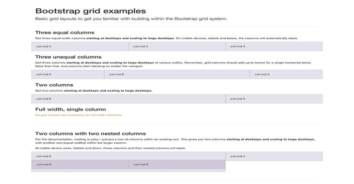
- Using a twelve column structure, five preset responsive tiers, Sass variables and mixins, and dozens of predefined classes, you can create layouts of all shapes and sizes with our powerful mobile-first flexbox grid.
Posted On : 2021-06-23 19:15:22 PM
Overview
Bootstrap Basic HTML Structure
To arrange and align information, Bootstrap's grid system employs a set of containers, rows, and columns. It is totally responsive and created with flexbox. Here's an example, as well as a more in-depth look at how the grid works.
The grid structure in Bootstrap allows for up to 12 columns across the page.
If you don't want to utilize all 12 columns separately, you may combine them to make broader columns:
| span 1 | span 1 | span 1 | span 1 | span 1 | span 1 | span 1 | span 1 | span 1 | span 1 | span 1 | span 1 |
| span 4 | span 4 | span 4 | |||||||||
| span 4 | span 8 | ||||||||||
| span 6 | span 6 | ||||||||||
| span 12 | |||||||||||
Basic Bootstrap Classes:
xs(for phones - screens less than 768px wide)sm(for tablets - screens equal to or greater than 768px wide)md(for small laptops - screens equal to or greater than 992px wide)lg(for laptops and desktops - screens equal to or greater than 1200px wide)
A Bootstrap Grid's Basic Structure
<div class="row">
  <div class="col-*-*"></div>
  <div class="col-*-*"></div>
</div>
<div class="row">
  <div class="col-*-*"></div>
  <div class="col-*-*"></div>
  <div class="col-*-*"></div>
</div>
<div class="row">
  ...
</div>
To begin, make a row (div class="row">). Then, insert the desired number of columns (tags with.col-*-* classes). It should be noted that the numbers in. col-*-* should always add up to 12 for each row.
We've included some basic Bootstrap grid layout examples below.
