- Proper Way to Give Radius to Your Website Edges, Know The Trick
Posted On : 2021-07-05 19:23:00 PM
Overview
CSS Border Radius Examples
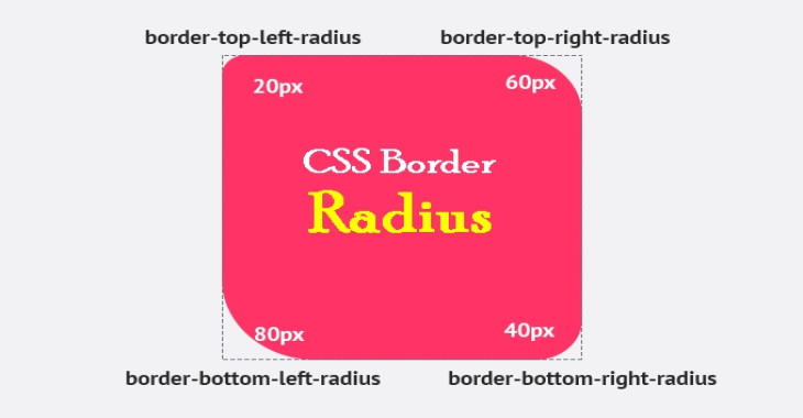
You can apply a border-radius to any element to give it "rounded corners." You'll only notice if there's a huge change. For example, if the element has a different background color or border than the element it is over. Simple examples include:
#example-one {
  border-radius: 10px;
  background: #BADA55;
}
#example-two {
  border-radius: 10px;
  border: 3px solid #BADA55;
}
Although it is no longer necessary, you might prefix with -webkit- and -moz- for the best possible browser support:
.round {
  /* Safari 3-4, iOS 1-3.2, Android 1.6- */
  -webkit-border-radius: 12px;

  /* Firefox 1-3.6 */
  -moz-border-radius: 12px;

  /* Opera 10.5, IE 9, Safari 5, Chrome, Firefox 4, iOS 4, Android 2.1+ */
  border-radius: 12px;
}
How to Doing Border Radius in CSS?
Take note of the sequence of those properties: the vendor prefixes are listed first, followed by the non-prefixed “spec” version. This is the proper method to go about it. The border radius is an excellent example of why we do it this way. The earlier -webkit- vendor prefix would perform something completely different than the “spec” version in a little more sophisticated variant of utilizing border-radius (where you give two values instead of one). As a result, if we just copy/paste the same values into all three properties, we may get different outcomes across browsers.
#example-three {
  border-radius: 20px;
  background: url(bglines.png); /* will get clipped */
}
